
|
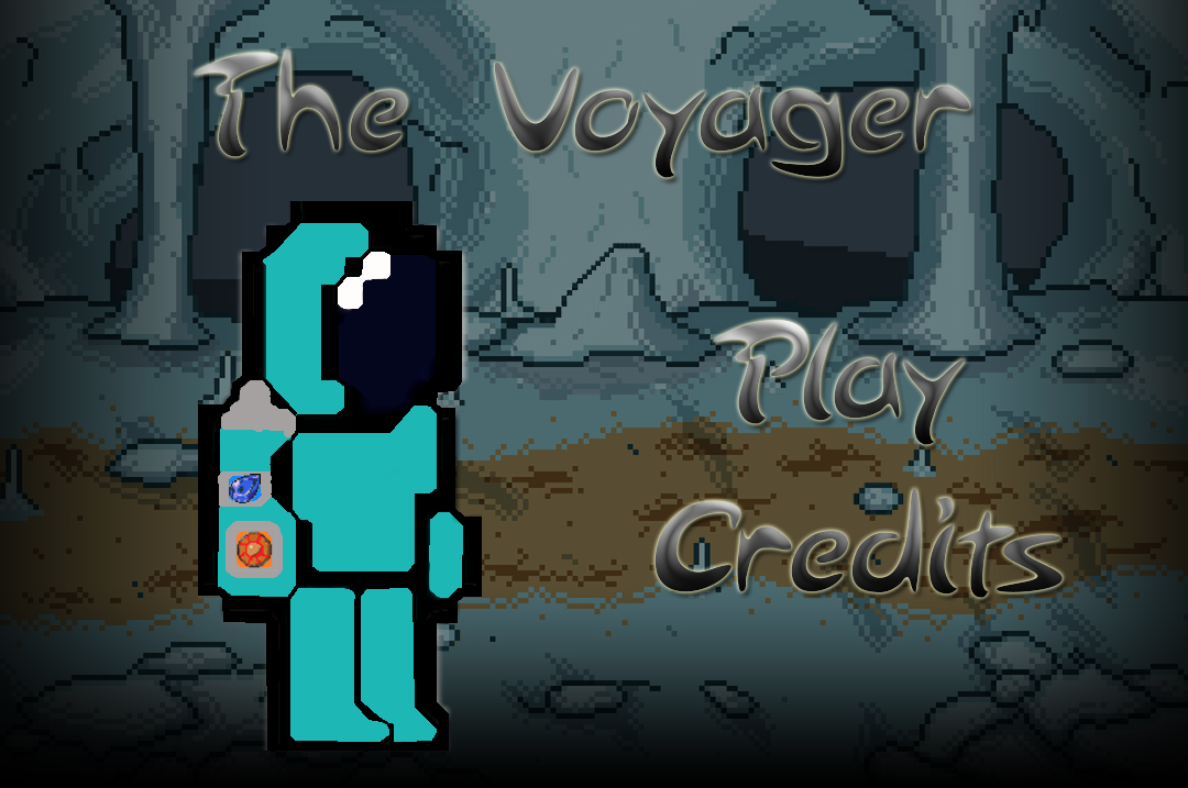
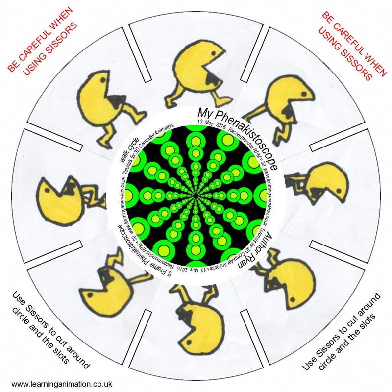
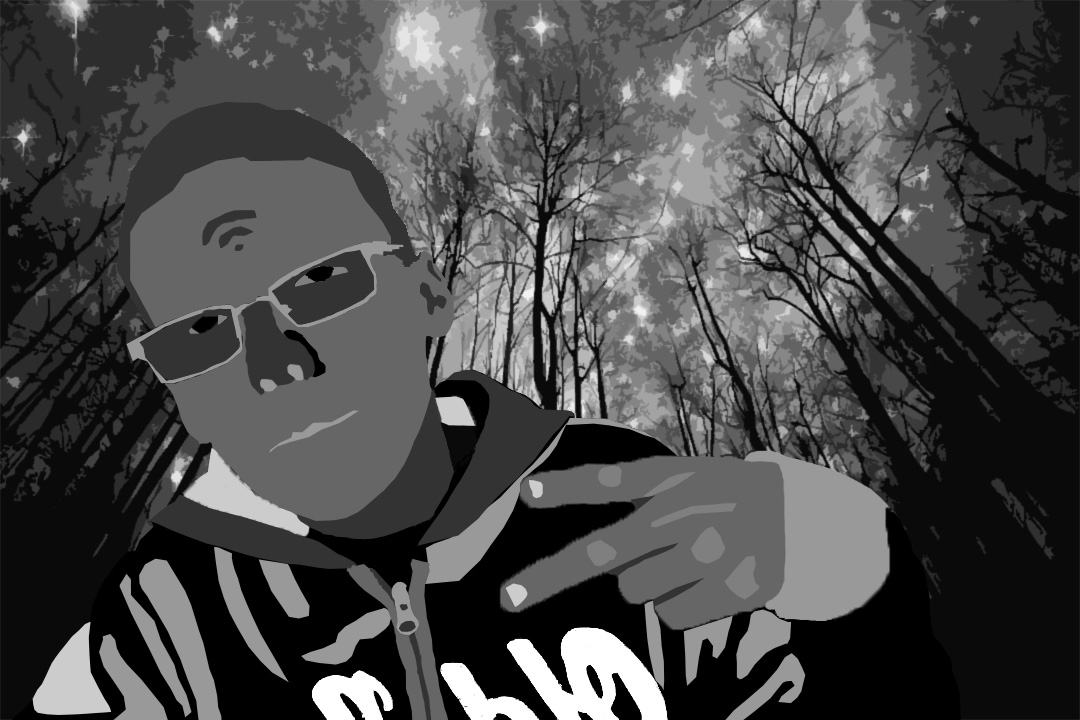
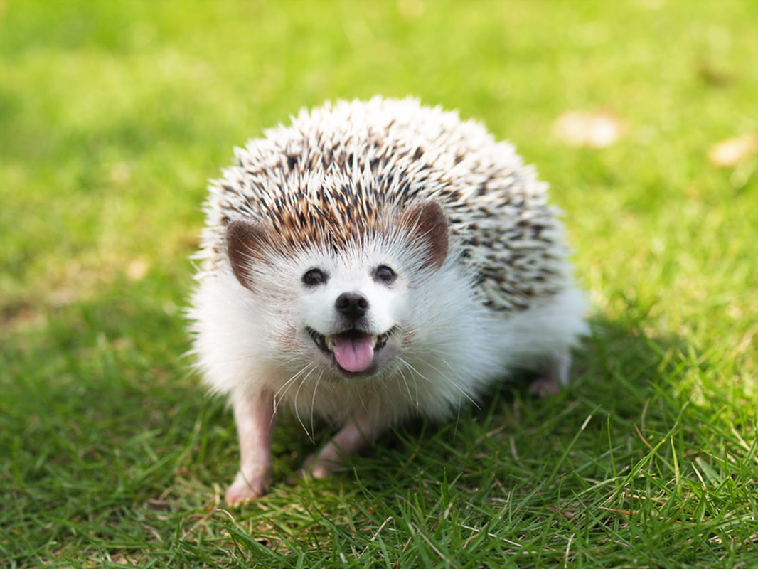
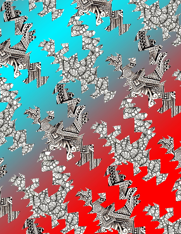
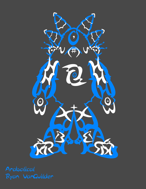
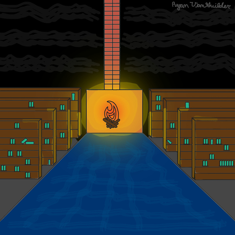
The Voyager When I started making this game I started with the graphics. My favorite part was the programming because we got to do cool things and do anything we wanted with the game. If I had more time, I would add in a thing to show where the end is. A phenakistoscope is a round circle that has images and when it spins around it gives it the illusion of motion. It gives it the illusion of my character walking. The phenakistoscope is interesting to me. The flip book seems cool to me because you can have more than a coupe frames and do something cool. I found making this kind of hard because you need to get the positioning right. Photo Unit The first picture I have is a boat in hand and my second is a sepia. I selected my first one because it looks funny but cool and the second one looks really sad but I like how the way I set everything up and I think it looks perfect. I did enjoy learning about it because when I grow up I either want to be an architect or a photographer. For my first picture I think that the strongest element is value and for my second it is texture. Color Theory Project I used the color theory achromatic. I feel like it does match what I am trying to express. I selected my background because I wanted it to feel like I was disappearing into a majestic place. I think I did use tints, tones, and shades. I feel like the shape element because everything is shapes. Critter Montage I used a hedgehog and a dog to make my hybrid. I used the dog face and the hedgehog body. What worked the best for me was the clone tool. I used it too help blend the outside of the dog's face with the hedgehog. To me I think it was balance and shape/form. Tessellation I believe that the strongest elements and principles of art are pattern and space/perspective because there is a pattern in it and there is filled space and empty space. I think that making a tessellation on the computer would be easier because you can copy and paste where on paper you have to glue it and if you mess up it could potentially mess up the whole entire thing. We learned about M.C. Escher before making these. Font bot Project My font is a serif font. I feel that my font matches my yeti because if certain letters didn't look the way that they did this would not look good to me. I did like the process of creating my font bot because I got to try something new and it was really fun for me. My font bot is a yeti that has now become a yeti god. At first he was just a regular yeti and when he was a baby he fell into a snow cone stand and all the stand had left was blue flavored die. So when he fell most of his body got covered in blue die for the snow cones. He went on a rampage and scared everyone out of the mountains so his kind could live in peace up in the mountains. The yetis praised him and he became a God. He got really big and grew horns. Also he got the power to whenever he ate something he would gain that speciality so he could use it himself. Now he still lives up in the mountains ready to scare off anyone who invades his home. Square 1 Art Project When I created this at first I was having a little bit of difficulty. I first sketched my fireplace and then my bookcases to get my scale for them. Then, I drew the carpet and made the bookcases 3D. I added the color for the bookcases and books. Then, add the carpet add background colors. Next make the glow and then add the textures in the background. For, my element I used color and for my principle emphasis. I didn't really like using the tablets because I couldn't keep my hand steady when I was drawing. I used the value aspect of the project. I made a glow for my fire and made some shading on the bookcases. I like art where people take something, keep the shape, and then put a different picture on it. I like pandas so I got this picture and I also like cupcakes. I do not know the artist but I wish I did. |
